Inspiration
Good to see you!
Welcome to Dulux
Terms & Conditions
Registration complete
Successfully registered, please login
Registration complete
Forgotten your password?
Please enter email address associated to your account
Change Password
Password changed successfully.
Request sent!
For more tailored inspiration, please fill in the 3 questions below.
If you have concerns about your privacy?
Read our Privacy Policy.
Delete Account
Simple decorating tips for sharing space as a family.
Not only are our homes more open than ever – kitchen diners, mezzanine sleeping platforms, balconies and skylights or conservatory bringing the outside world in – so are our families. Where once roles and spaces were strictly defined, now we all share in making our home what it is.
The result? We all use the areas of our home together but we each have our own ideas about how they should look. Rather than that being a challenge, make it an opportunity. Find an interior solution that reflects the best of all the personalities in your home.
“Good sharing comes with the ability to be open to other perspectives,” says Marieke van der Bruggen, Senior Colour Designer at AkzoNobel. “Communal spaces work best when they give out a positive, open and light-hearted atmosphere. Colour is your power tool in creating such a space.”
Ask most people for their favourite colour and it will be a strong one: the primary colours, or maybe a bright pink or rich purple? “We engage with such colours,” says Marieke. “By starting your space with a neutral base such as earthy grey, cream, soft lilac or the grey blue Colour of the Year 2017, Denim Drift, you can bring in everyone’s favourites as vibrant accents.”
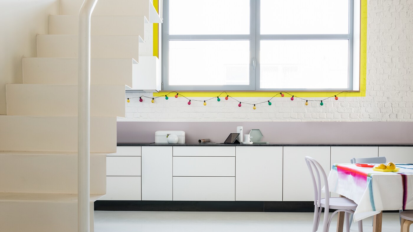
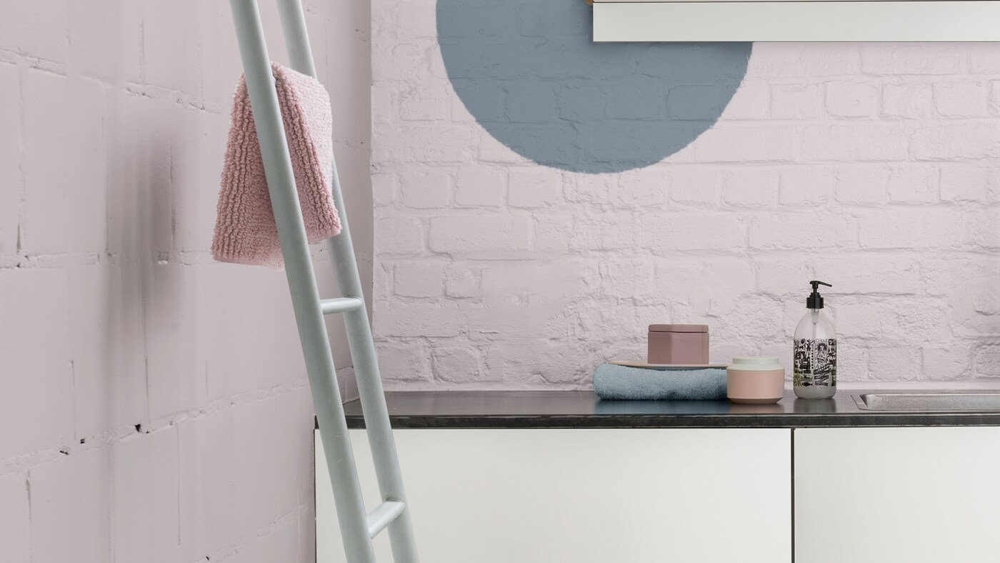
“While feature walls give your space a big focal point, you could also try more playful bursts of colour by giving windows a bright border frame – I chose an energising sunshine yellow – or unexpected little geometric shapes – I tried a subtler two-tone effect with a grey blue circle on a pale lilac wall against a window frame.”
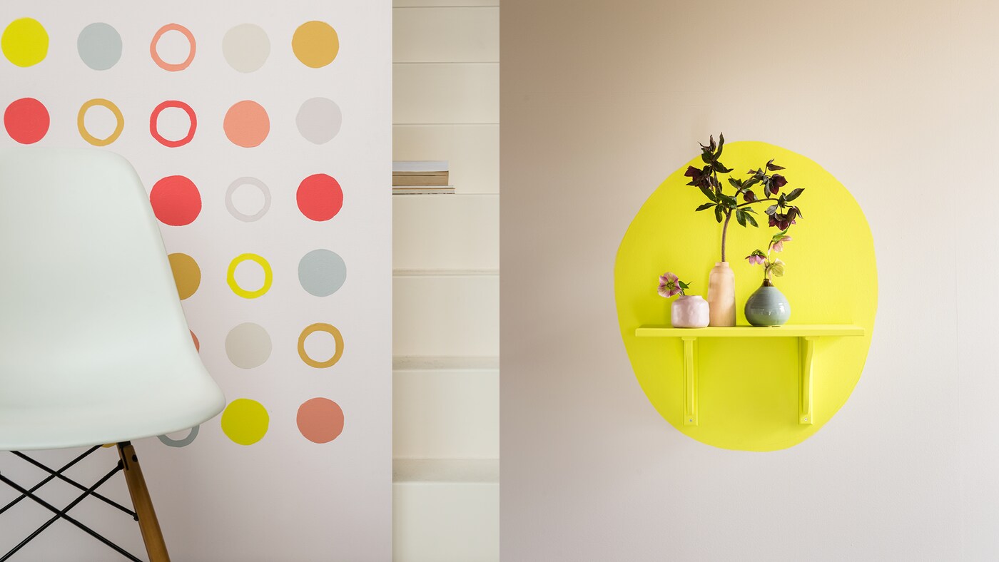
In shared spaces, it’s great for everyone to be actively involved. “Try creating a feature wall of circles in complementary hues – I chose a palette from light beige and grey through ochre and salmon pink to rosy pink and bright yellow – with each family member painting a certain colour,” suggests Marieke. “The circles don’t have to be perfect – that’s what makes your home feel unique.”
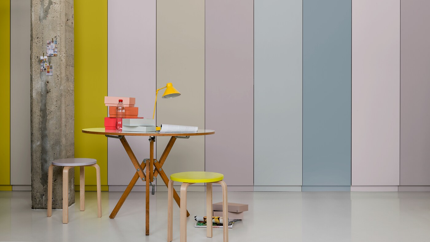
Most feature walls are a single block of colour, contrasting with a light neutral base on the other walls, but there are so many other possibilities: “Using different hues can create amazing impact. How about bold, alternating stripes for maximum energy or gradually fading from your accent colour back to the base colour to create a calming sunset feel?”
Watch the video and read more
Find great ways to make the most of your space, read Shared living: ideas for your own breakout space.
{USE SECTION BELOW IF LOCAL MARKETS DON’T WANT TO USE ‘WHICH PAINTS’ SECTIONS}
Get the look with these paints:
S0.10.50 / 87BG27/077
ZN.02.73 / 40RR57/045
SN.02.67 / 95BG49/025
F2.04.74 / 19YY61/057
G4.50.75 / 66YY61/648
C6.22.61 / 38YR40/290
B6.40.50 / 00YR26/490
F1.35.65 / 21YY45/405
ZN.02.80 / 26RR73/037
Add a new job
Add a new job
Edit a job
Delete job
Are you sure? All notes, photos and saved items will be deleted.
Save colour
Save to My Workspace
Save product
Save job


